What for many of us was a four year journey to bring all the adidas marketing together for 2010.
Launch films, brand and product design, fonts, print, TV, Facebook pages, X-Box covers and daily updates throughout the tournament. We had over 150 people for the final 12 months which included our digital department RIOT, and a team of 15 on the ground in South Africa shooting content daily.
And it started with 11 threads. 11 national languages. 11 players. 11 colours. The shape and pattern that defined the adidas campaign.
We created a QUEST.
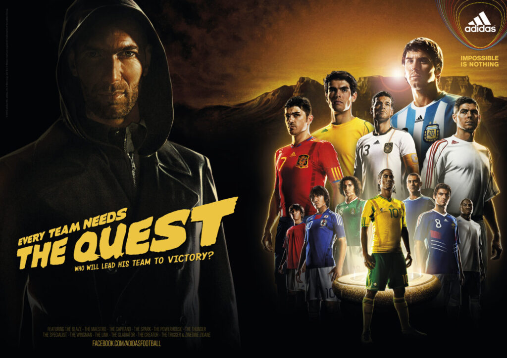
And added the players. This was fun; 32 players we’d named and a four page instruction manual on how to set headlines. It was documented as a simple perspective warp on such long lines became unreadble.
We couldn’t expect each country to do it, so I arranged all 32 to be set in Adobe Illustrator, in all the main languages used for the World Cup, and then exported to flattened AI, PDF, SVG and PNG for markets.
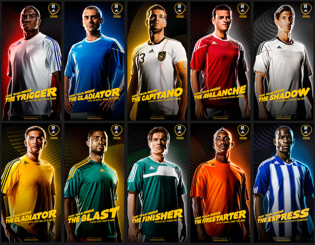
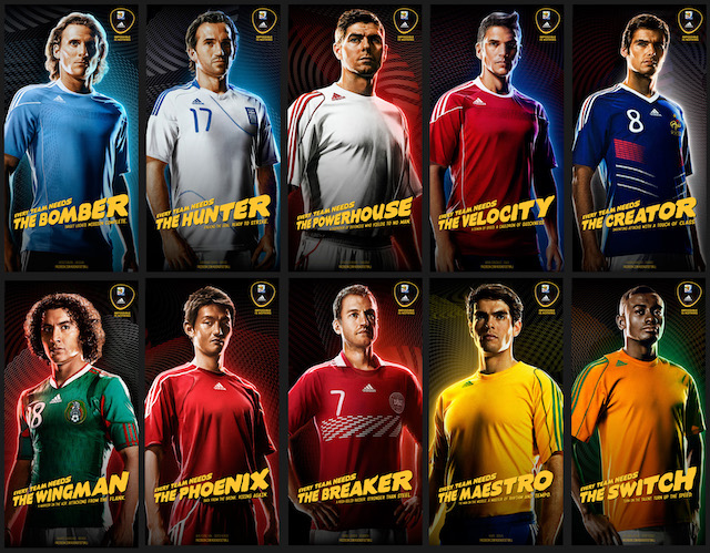
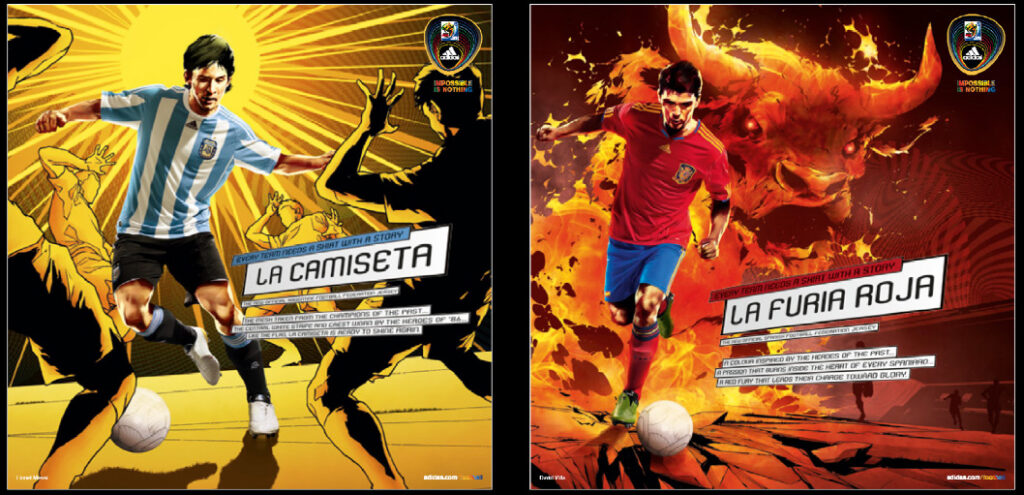
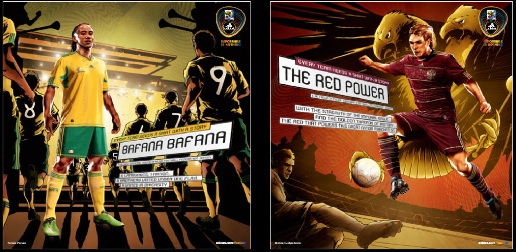
And then the teams…
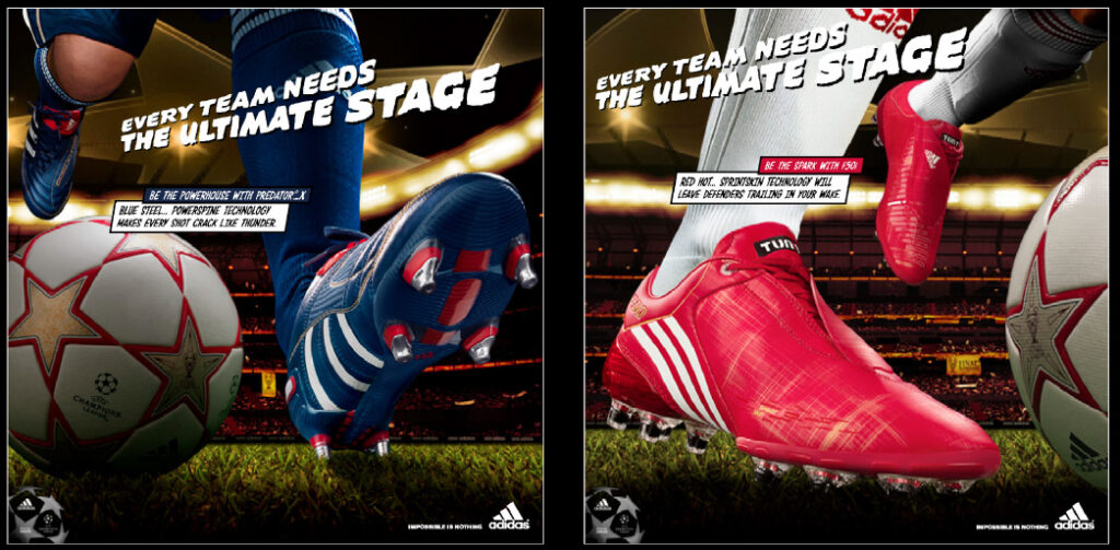
And of course an product…
Our in-house Typographer designed the font we named ‘Unity’ for the players shirt names and numbers.
(Reminder to self, find some photos of the font used on shirt backs).

Our in-house Studio got to design and create this one as the headline for the ATL print as we couldn’t license the font chosen.

We designed the World Cup ball.
Some of the PR materials we created to support the campaign. I’ll link to the designer behind the entire campaign; Julian Wade, when he’s finally happy with his own website and publishes it!
Then, a story that never came out until after the World Cup. On the dat of the World Cup final, adidas contacted 180 management to tell us we were losing the business. It went to Sid Lee without pitch. Ce la vie.